In the ever-evolving digital design landscape, minimalist website design focuses on the essentials, offering a user experience that is both efficient and aesthetically pleasing.
This article aims to delve into the essence of minimalist website design in the context of web pages, tracing its historical roots and exploring its principles. We will examine how what began as an artistic and architectural movement has transformed into a foundational approach to web development.
Whether you are a beginner embarking on your design journey or an expert seeking to refine your skills, this article will navigate the practicalities of its application. We will cover what makes minimalist design a challenge and a joy to implement.
Embrace simplicity, where less is not just more—it’s everything.
Foundations of Minimalist Design
Minimalist design, characterized by its simplicity, efficiency, and focus on the essentials, is a philosophy that transcends mere aesthetics.
It is a deliberate choice to embrace purity and functionality, stripping away the non-essential to highlight what truly matters.
Definition and Principles
At its core, minimalist design reduces elements to their simplest form. It’s not merely about having fewer items on a page or in a space but about achieving greater impact through careful selection and emphasis on what remains. The principles of minimalist design include:
- Simplicity: Everything unnecessary is eliminated. What remains is streamlined to its essence without sacrificing functionality.
- Clarity: Clear presentation and easy navigation are paramount. Elements are arranged logically and purposefully, making the intended message or function obvious.
- Emphasis on Functionality: Every design choice is made with utility in mind. Form follows function, meaning that aesthetic decisions support the design’s usability.
Historical Overview
The roots of minimalist design can be traced back to various visual arts and architecture movements, particularly those that emerged in the early to mid-20th century.
In the post-World War II era, Minimalism became a defined art movement in the visual arts. A movement characterized by simple geometric forms and a monochromatic palette. Architects like Ludwig Mies van der Rohe adopted the mantra “less is more,” creating spaces that were open, fluid, and devoid of unnecessary decoration.
As digital technology emerged and evolved, these principles found new expression in web design. A clutter of competing fonts, colors, and animations marked the early days of the Internet.
With time, as designers began to value user experience and efficiency more, minimalist design principles became increasingly important.
Minimalist Website design in the digital age emphasizes visual simplicity and simplifying user tasks. It aims to remove obstacles between the user and the content or functionality they seek, making the web more accessible and enjoyable for everyone.
Characteristics of Minimalist Web Design
The Minimalist website design philosophy hinges on characteristics distinguishing it from more complex or ornate design approaches.
Visual Elements
- Use of Negative Space: Often referred to as white space, negative space is a fundamental component of minimalist web design. It refers to the space around and between elements on a page. Far from being mere emptiness, negative space is a powerful tool that helps organize the layout, improve readability, and guide the user’s focus toward the most critical parts of the site.
- Limited Color Palette: Minimalist website design typically employs a restrained color scheme, often consisting of neutral backgrounds with accents of color for highlights or calls to action. This limited color palette creates a visually cohesive experience and draws attention to important elements without overwhelming the user.
- Typography as a Central Design Element: Typography is not just a means of conveying information; it’s a crucial design element. Selecting the right font and size can express brand personality, create visual interest, and improve legibility. The simplicity elsewhere in the design allows typography to take center stage, with ample space allowing each letter and word to breathe, enhancing the overall readability and aesthetic appeal.

Content and Layout
- Streamlined Content: Minimalist website design advocates content that is pared down to the essentials. Every text, image, or multimedia is carefully considered for its value and relevance to the user’s experience. This makes the information more digestible and ensures that the most important messages capture the user’s attention.
- Simplified Navigation: Navigation in minimalist web design is intuitive and straightforward, often employing a single menu or a simple vertical or horizontal navigation bar. The goal is to reduce the cognitive load on users, making it easy for them to find what they are looking for without unnecessary clicks or complex navigation paths. This approach enhances user experience and contributes to a cleaner overall design.
The characteristics of minimalist website design work together to create an environment where content is king, and user experience is paramount.
Examples of Minimalist Websites
These examples of minimalist web design adhere to previously discussed characteristics—such as negative space, a limited color palette, and simplified navigation—and demonstrate how these elements come together to create engaging and compelling user experiences.
Here, we explore a few standout examples of minimalist web design, analyzing what makes them effective and how they embody the principles of minimalism.
1. Apple
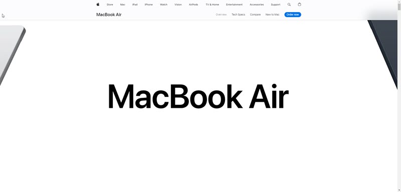
Apple’s website is a quintessential example of minimalist design applied effectively in a corporate context. The site features a clean layout, ample white space, and a focus on high-quality imagery of its products.
The navigation is intuitive, with a simple top menu that provides easy access to product categories, support, and shopping options. Apple uses a limited color palette, with a white background that makes the vivid product images pop. Typography is used strategically to guide the user’s attention to important information.
This approach reinforces the brand’s sleek and modern identity and enhances the user experience by making information easily accessible and digestible.
2. Dropbox
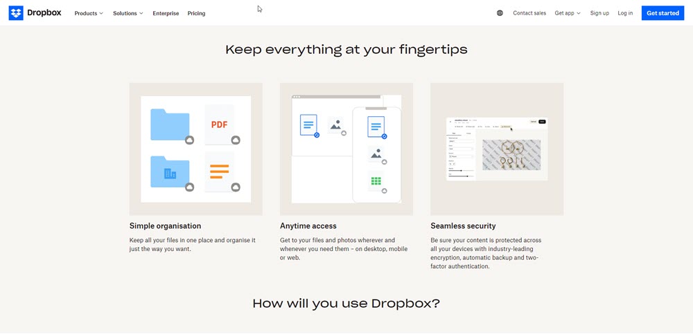
Dropbox’s website showcases minimalism through its design and content strategy. The site uses light-colored space to create a sense of openness and clarity, directing focus to key messages and calls to action.
The color scheme is restrained, with blue accents aligning with the brand’s identity. Typography is clean and straightforward, facilitating easy reading.
Dropbox’s navigation is simplified, highlighting essential paths users might take, such as learning about features, pricing, or signing in.
This minimalist design approach helps communicate Dropbox’s value proposition clearly and concisely, encouraging users to explore and engage with the service.
3. Medium
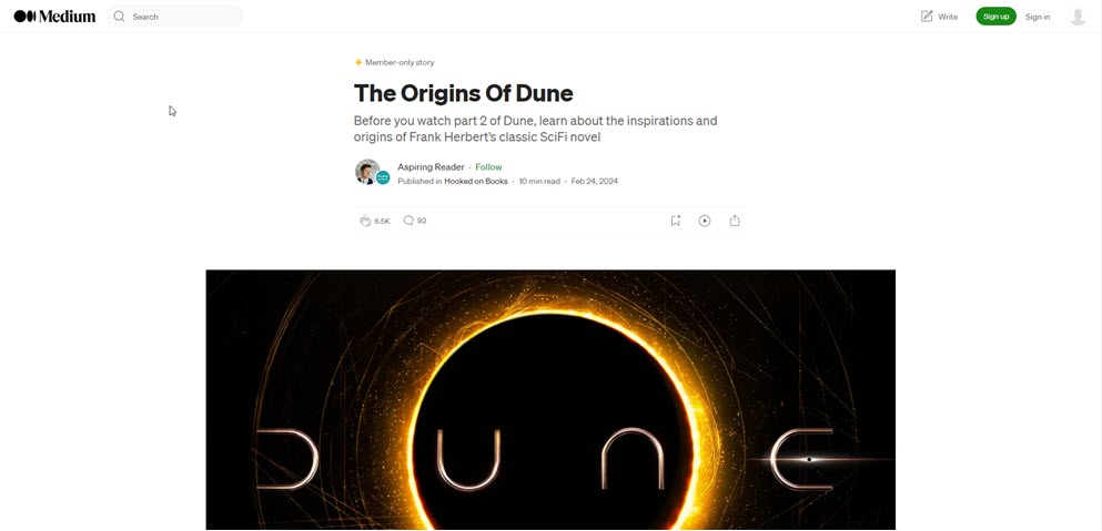
Medium leverages minimalism to prioritize content readability and user engagement. The platform’s design is characterized by ample negative space, ensuring the focus remains on the written content.
The color palette is predominantly white and black, with minimal use of color for links and buttons, reducing distractions and enhancing the textual content’s visibility.
Navigation is straightforward, with a simple menu that allows users to explore publications, topics, and personal reading lists.
Medium’s design exemplifies how minimalism can enhance content-centric platforms, making it easier for readers to consume and interact with content.
Whether the goal is to showcase products, facilitate service engagement, or highlight content, minimalism offers a powerful approach to web design that prioritizes the user’s experience above all.
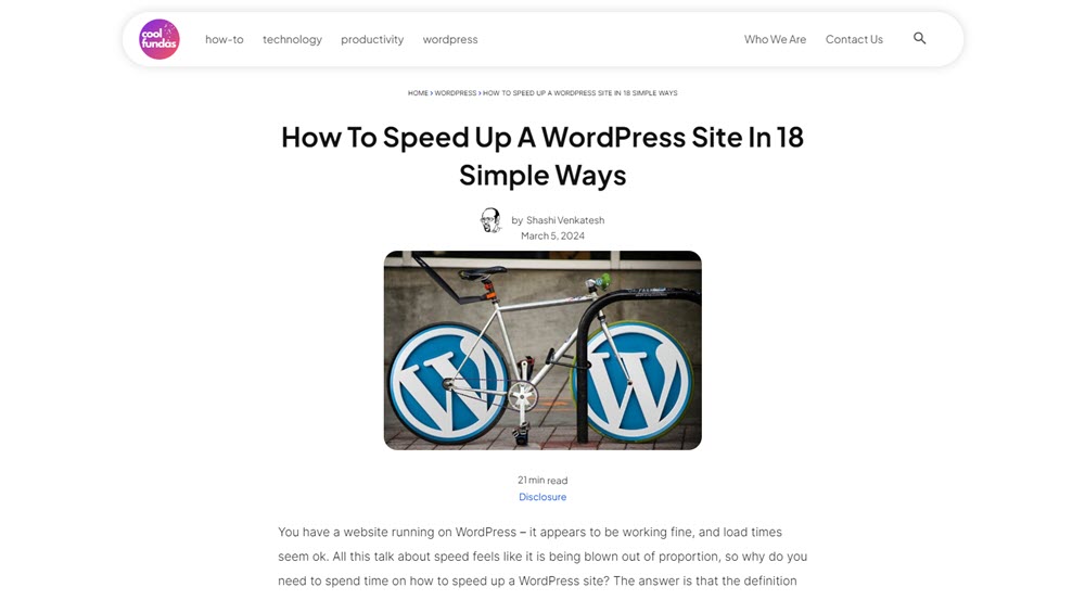
If you look at this blog (coolfundas.com), the website design has been influenced by minimalism. You can see the use of white space to help focus the reader’s attention on the post. The headlines use a geometric sans serif font that delivers a clean look. The website uses 2-3 colors, with content spaced out evenly.
Here is another example of Minimalist Website design from Studiopress – a web design studio.
Advantages of Minimalist Design
Minimalist design goes beyond aesthetic appeal and user experience. It can also significantly improve site performance.
Below, we explore the major advantages of adopting a minimalist design approach for web pages.
Improved User Experience
- Faster Loading Times: Minimalist website design often results in faster page loading due to fewer elements and reduced use of heavy graphics or animations.
- Easier Navigation: Simplified navigation and fewer menu options allow users to find what they’re looking for more efficiently.
- Enhanced Readability: Minimalist web pages improve readability by using ample negative space and focusing on typography.
Aesthetic Appeal
- Timeless Elegance: Websites adopting this style tend to look modern and fresh for longer, avoiding frequent redesigns to keep up with passing design trends.
- Focus on Content and Products: By stripping away non-essential design elements, minimalist web pages bring the content or products into sharper focus. This can be particularly beneficial for portfolio sites, online stores, and platforms where the primary goal is to showcase the work or items being offered.
Enhanced Compatibility
- Better Responsiveness Across Devices: Minimalist design typically translates into more adaptable layouts, making websites more responsive across various screen sizes and devices.
- Simplified Maintenance and Updates: Websites with minimalist design are generally easier to maintain and update due to their simpler structure and fewer components. This can lead to lower development and maintenance costs over time.
SEO Benefits
- Improved Site Performance and SEO: The efficiency and speed of minimalist websites contribute to better search engine rankings. Search engines like Google factor in site speed and mobile responsiveness when ranking sites.
- Increased Engagement and Lower Bounce Rates: By facilitating a more enjoyable and accessible user experience, minimalist web pages can increase engagement.
Challenges and Limitations of Minimalism
While minimalist website design offers numerous advantages, such as improved user experience and aesthetic elegance, it has challenges and limitations.
These drawbacks stem from minimalism’s essence—its focus on simplicity and reducing elements to the essentials.
Minimalism can lead to oversimplification, design constraints, and usability issues when not carefully implemented.
Risk of Oversimplification
- Potential to Omit Crucial Information: In pursuing simplicity, there’s a risk that important details or functionalities might be overlooked or intentionally omitted. This can frustrate users seeking specific information or features that are not immediately apparent or accessible.
- Underwhelming User Experience: A too-minimalist approach can lead to an underwhelming experience for users who expect a certain level of interaction or detail from a website.
Design Constraints
- Limited Creative Expression: The strict adherence to minimalist principles can sometimes box designers into a corner, limiting their ability to experiment with bold or elaborate designs.
- Difficulty in Standing Out: Without distinctive features or creative flair, minimalist websites risk blending in with the multitude rather than capturing the user’s attention.
Usability Issues
- Prioritizing Aesthetics Over Functionality: Prioritizing visual simplicity over practical usability can lead to designs that, while visually appealing, may not adequately address users’ needs or expectations, particularly regarding navigation and information accessibility.
- Assuming User Familiarity: Minimalist designs often rely on users understanding certain conventions or gestures, such as hidden menus (hamburger icons) or swipe actions. This assumption can alienate users who are not tech-savvy or familiar with these conventions.
Despite these challenges, finding the right balance is the key to successful minimalist web design.
This involves a better understanding of the target audience, a clear definition of the website’s goals, and a creative approach that finds innovative ways to convey brand identity and user value within a minimalist framework.
When to Use Minimalism in Web Development
So when should we adopt a minimalist design for a web project?
Here are a few scenarios in which minimalist design is particularly effective and situations in which a more complex design might be better.
Suitable Scenarios for Minimalist Design
- Portfolio Websites: For artists, designers, photographers, and other creatives looking to showcase their work, minimalist design can be highly effective. It allows the visual content to take center stage, minimizing distractions and focusing the user’s attention on the portfolio pieces.
- Blogs and Editorial Sites: Minimalism can enhance the readability and navigability of content-centric sites such as blogs or online magazines. A clean, uncluttered layout helps ensure the text remains the focal point, improving user engagement and content consumption.
- Landing Pages and Marketing Websites: Minimalist design can be particularly powerful for landing pages or websites to market a single product or service. The simplicity of the design helps convey the core message and value proposition clearly and persuasively, encouraging users to take action.
- Startup Websites: For startups looking to establish a clear and memorable online presence, minimalist design can convey innovation and modernity. Simplified navigation and focused content can communicate the startup’s mission and offerings without overwhelming users.
Unsuitable Scenarios for Minimalist Design
- Complex Web Applications: A minimalist design might oversimplify the interface and hinder usability for web applications with extensive functionalities, such as enterprise-level platforms or comprehensive online services. Users of these platforms often rely on quick access to a wide range of tools and information, which may require a more complex design.
- E-commerce Sites with Large Inventories: While minimalist design can work well for boutique online stores with a limited selection of products, it might not be the best choice for e-commerce sites with extensive inventories. These sites may benefit from a design that accommodates more detailed categorization, filtering options, and product information.
Using minimalist design in web development should be a strategic decision informed by a good understanding of the website’s purpose, the needs and preferences of its intended audience, and the type of content it will feature.
Conclusion
If you want to adopt a minimalist website design, you should do it.
But don’t do it just because you like minimalism’s concept and appeal.
Like all things in life, minimalism works well only when there is balance. Simplicity and functionality on one side while ensuring your target audience gets exactly what they need.
There is no point in building a website that earns plaudits for design but misses on delivering to the end user.
As we conclude this exploration of minimalist web design, it’s clear that minimalism is not just about clean lines and open spaces but also about respecting the user’s needs and preferences.
In a world increasingly cluttered with information and distractions, minimalist web design offers a breath of fresh air—a reminder that, often, less truly is more.

